Hello,
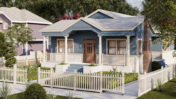
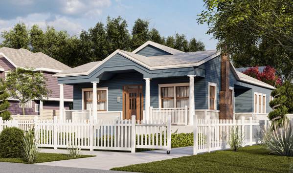
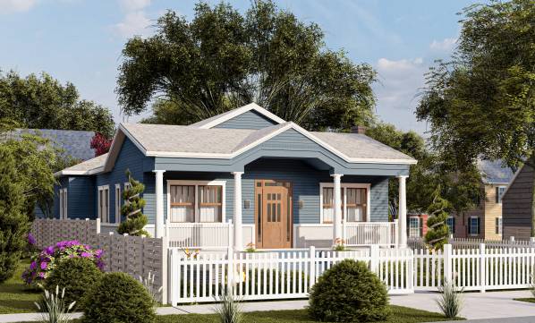
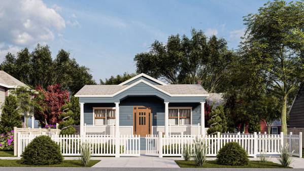
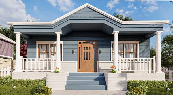
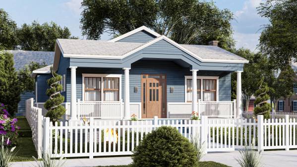
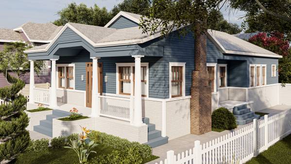
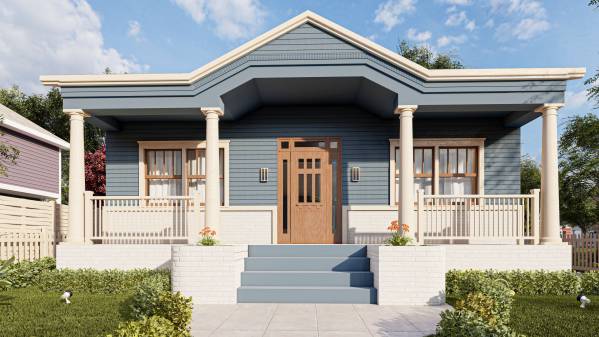
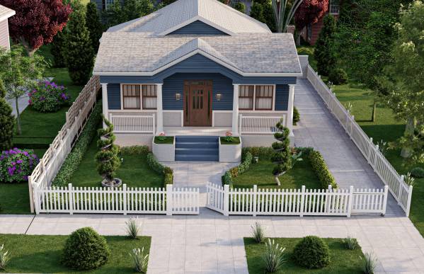
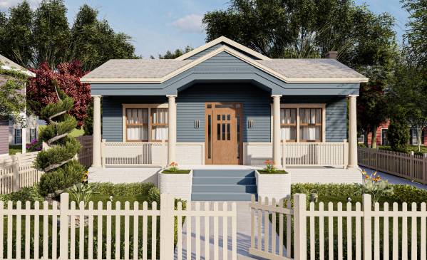
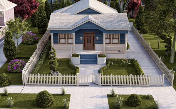
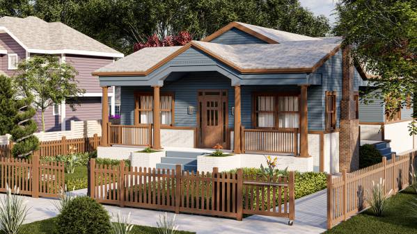
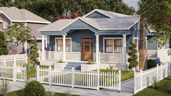
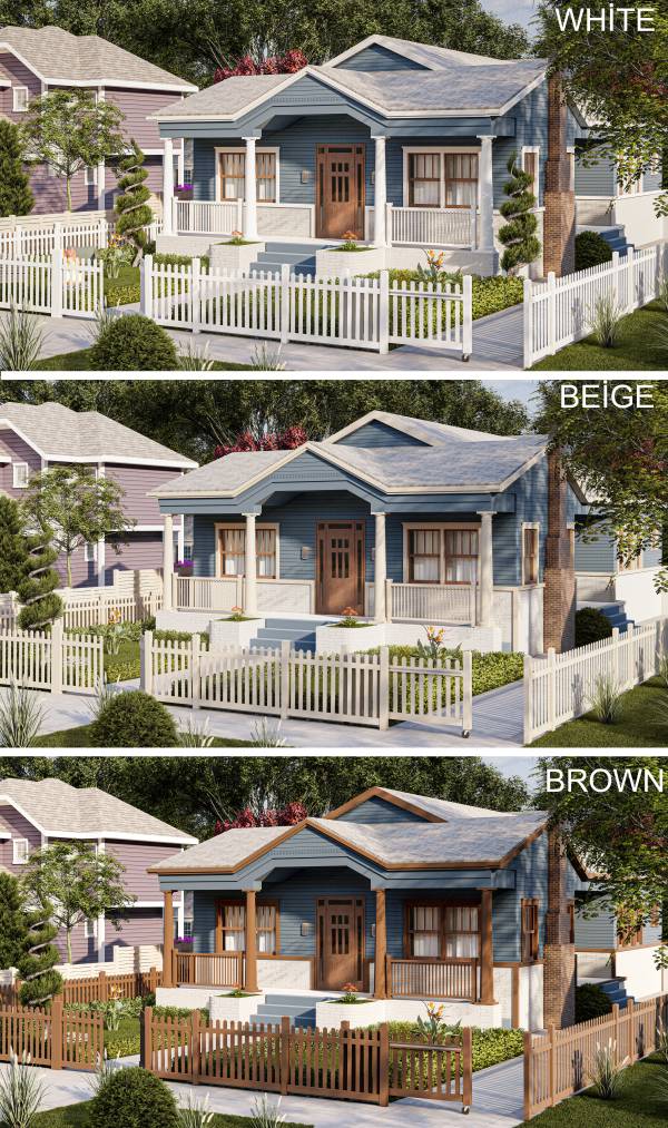
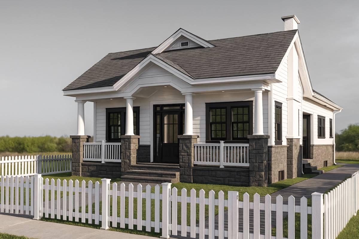
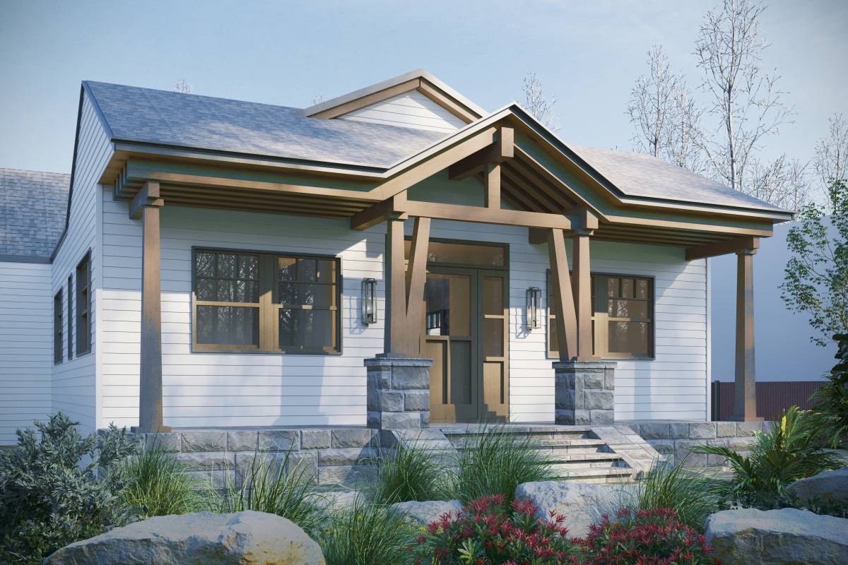
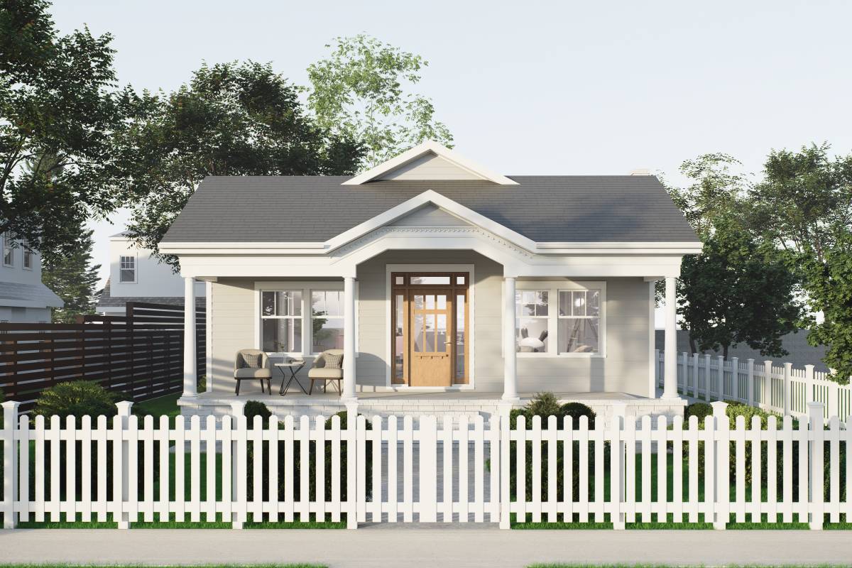
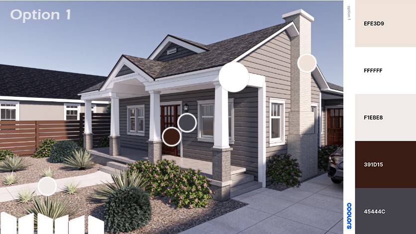
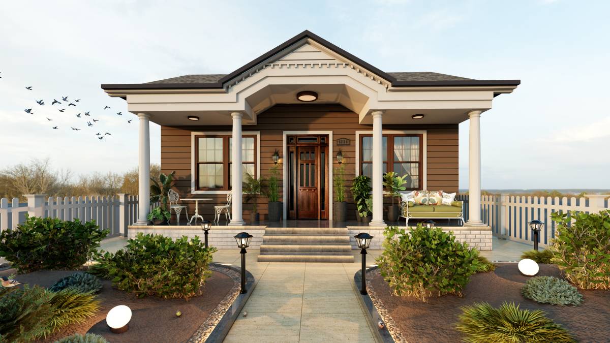
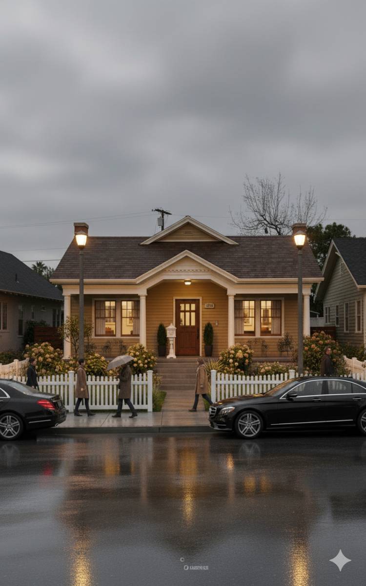
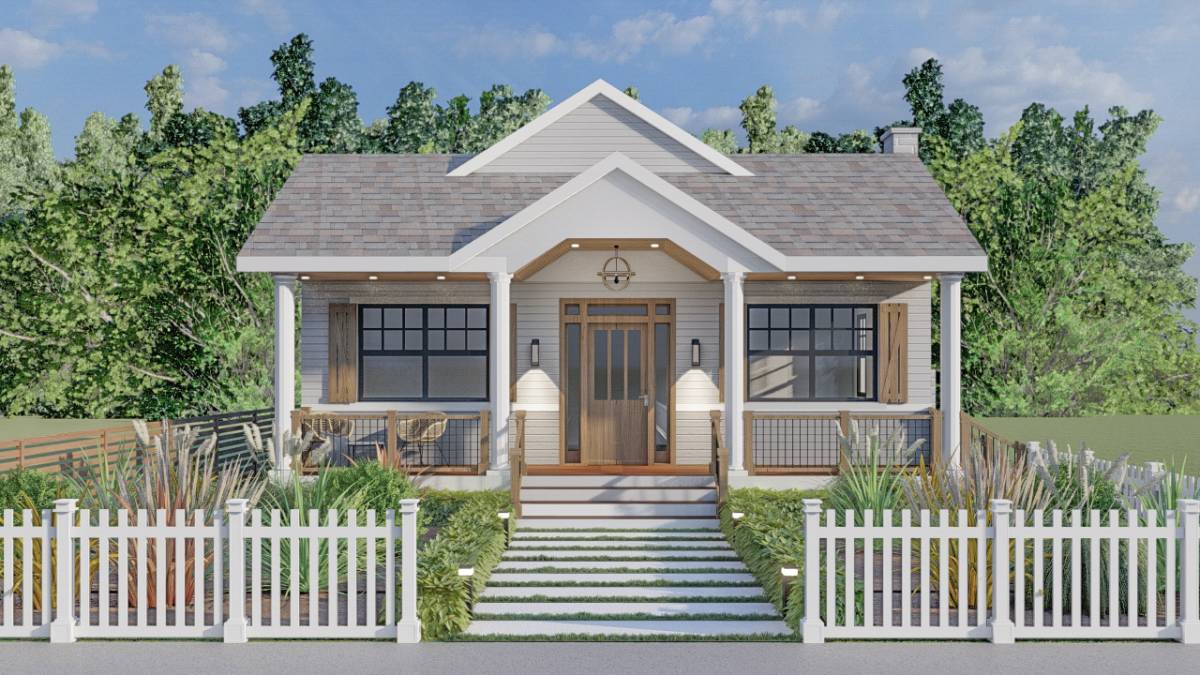
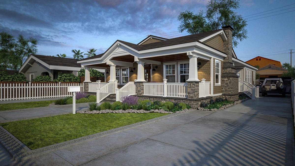
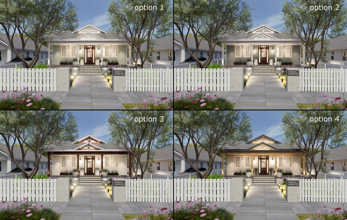
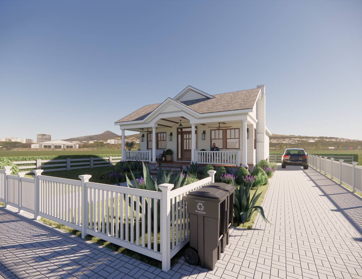
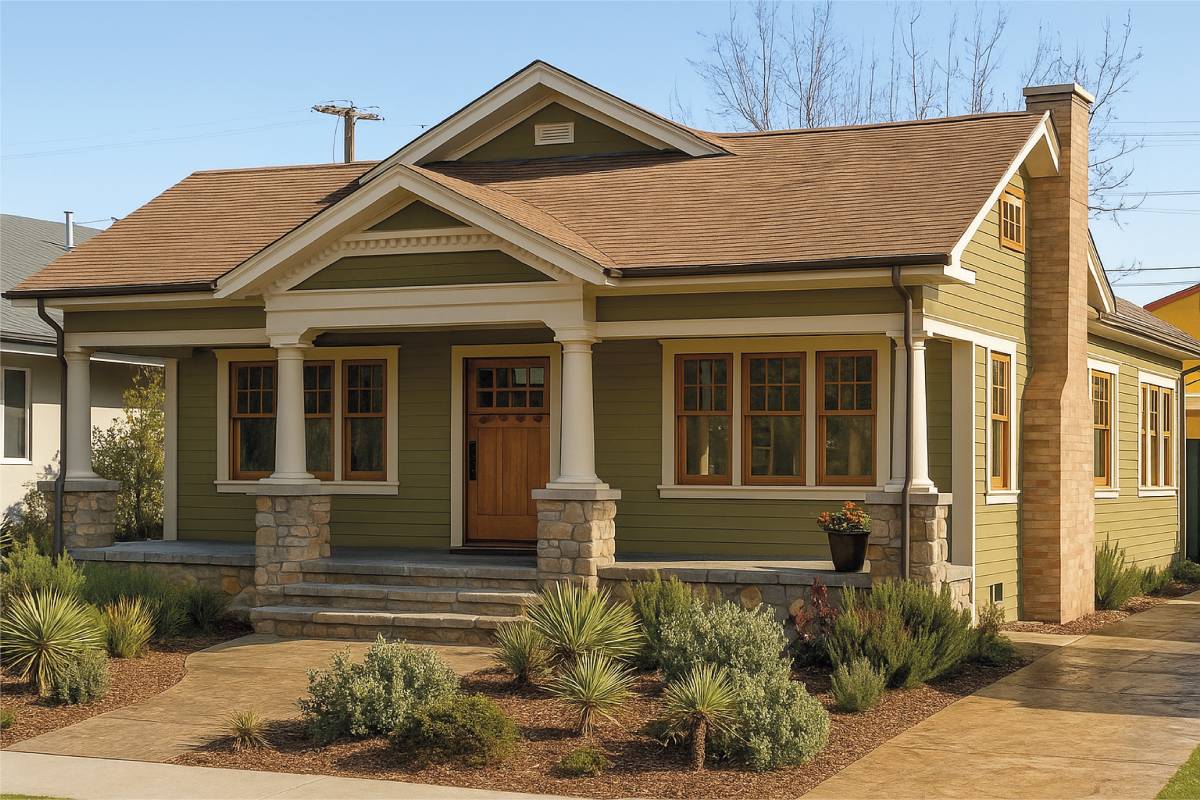
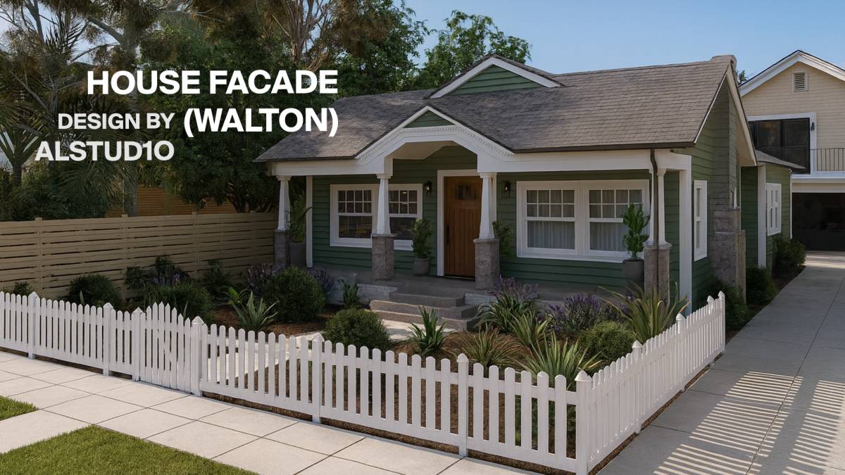
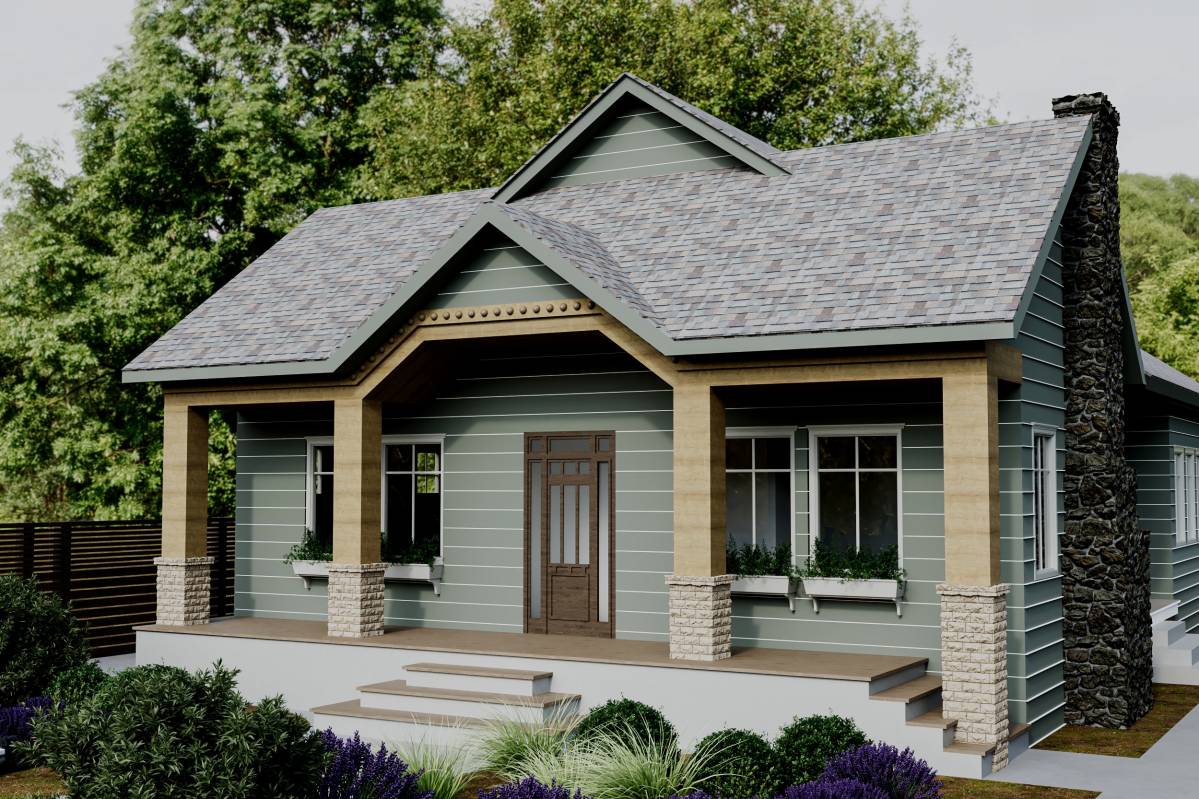
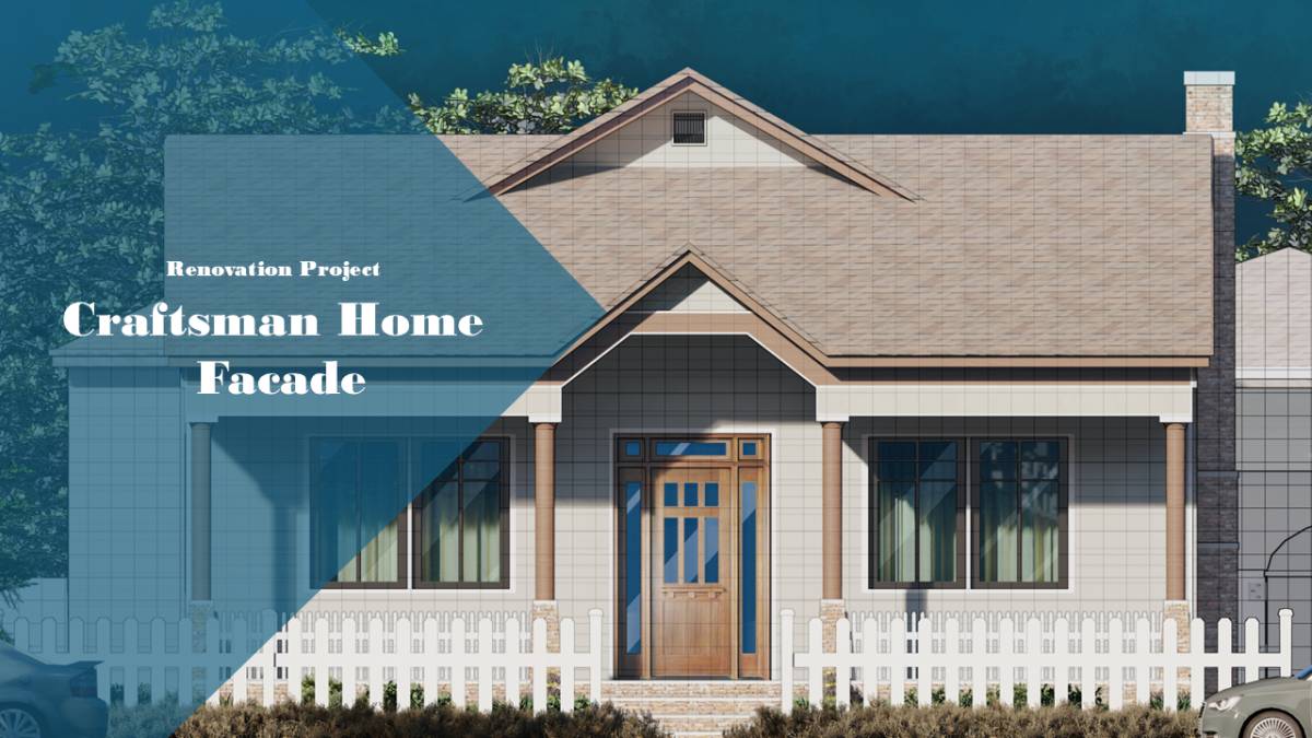
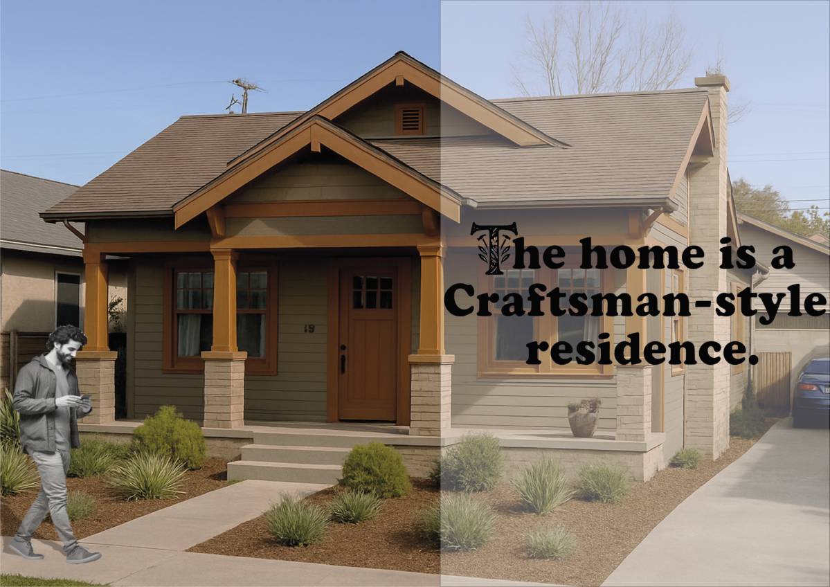
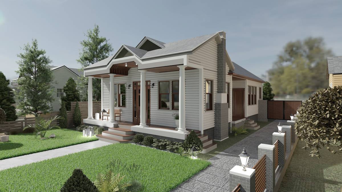
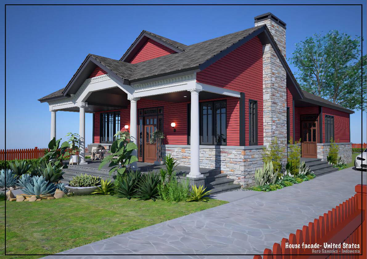
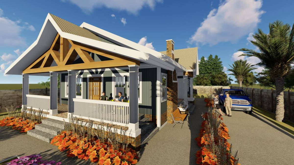
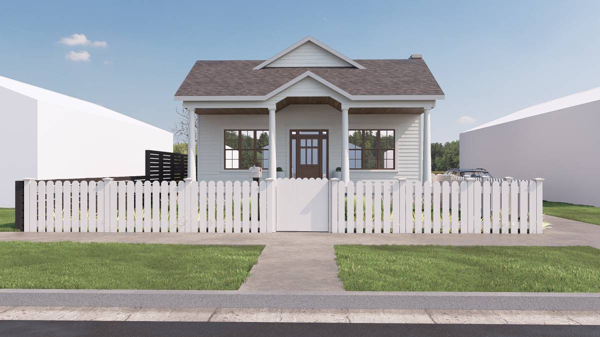
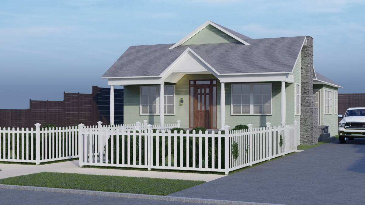
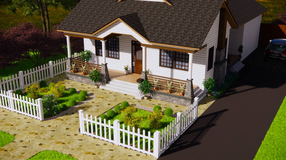
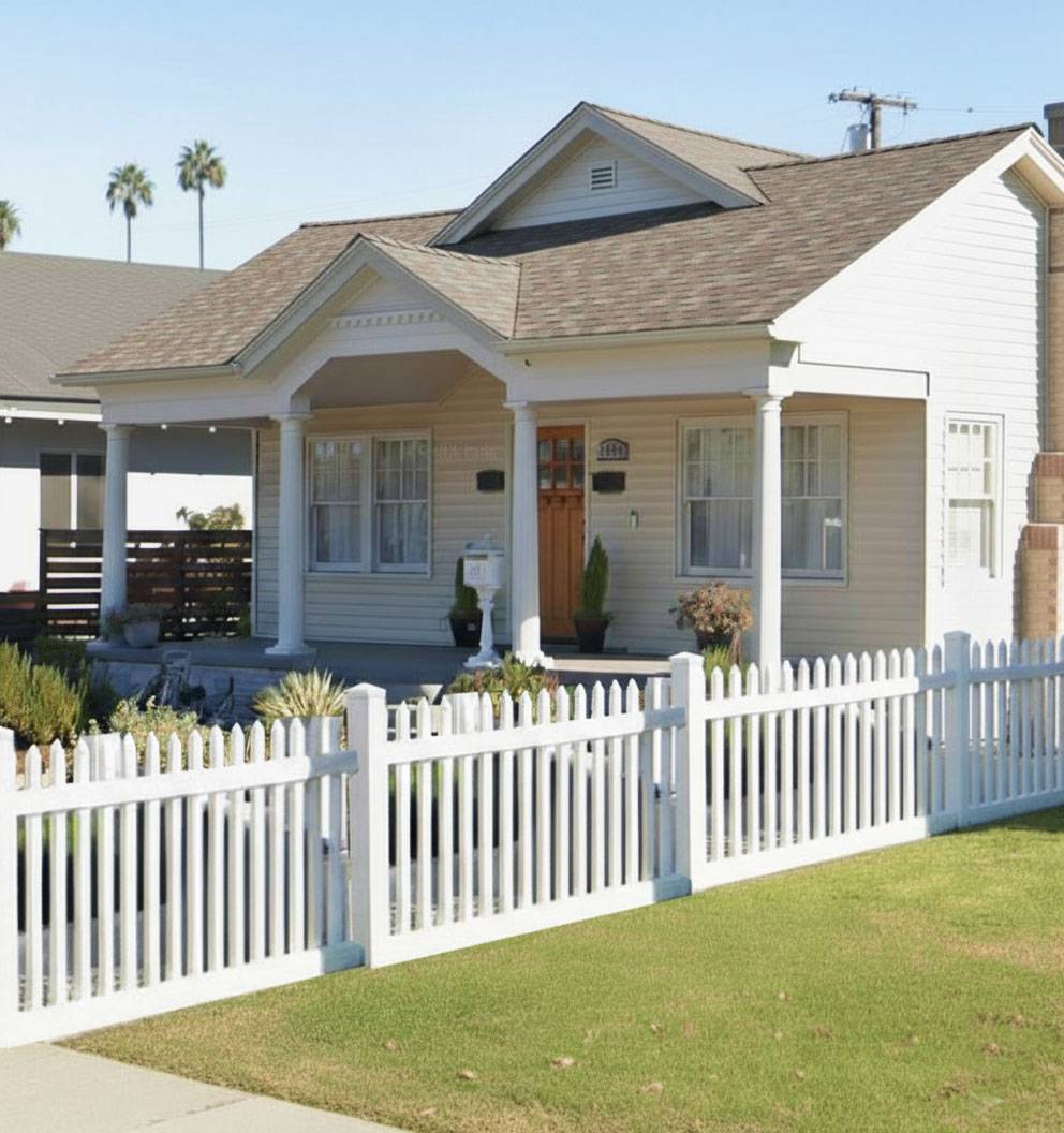
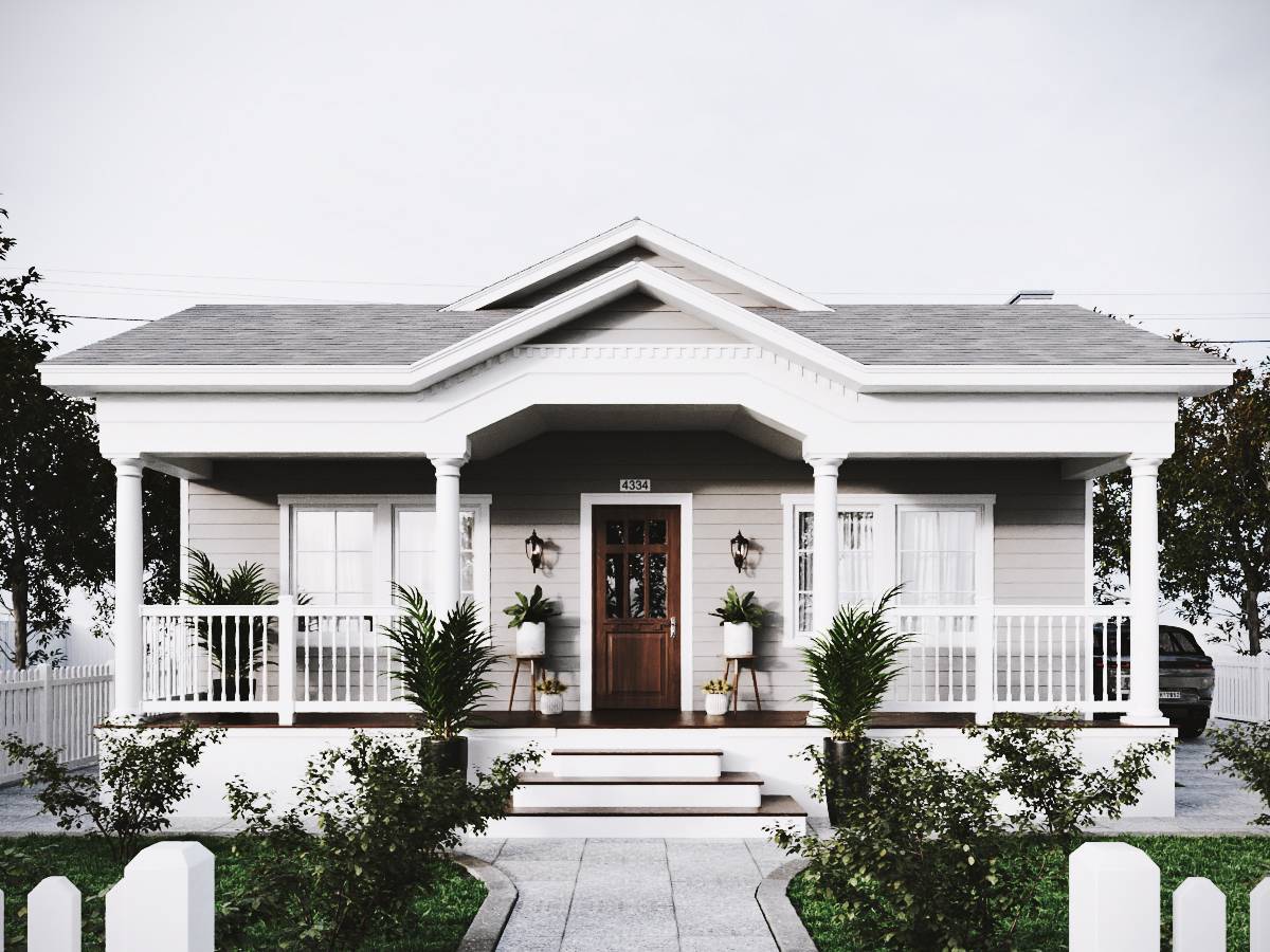
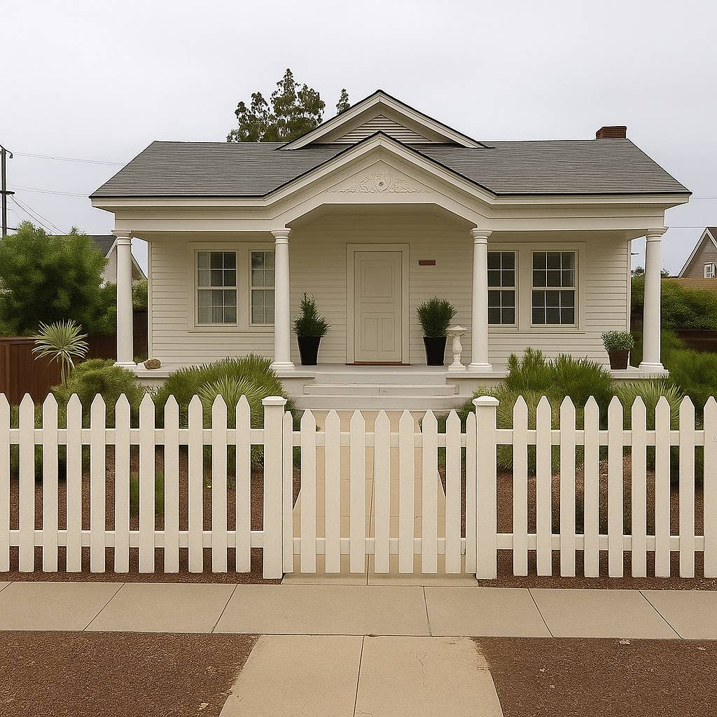
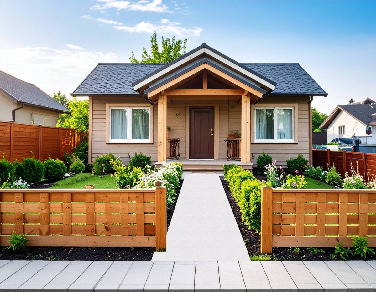
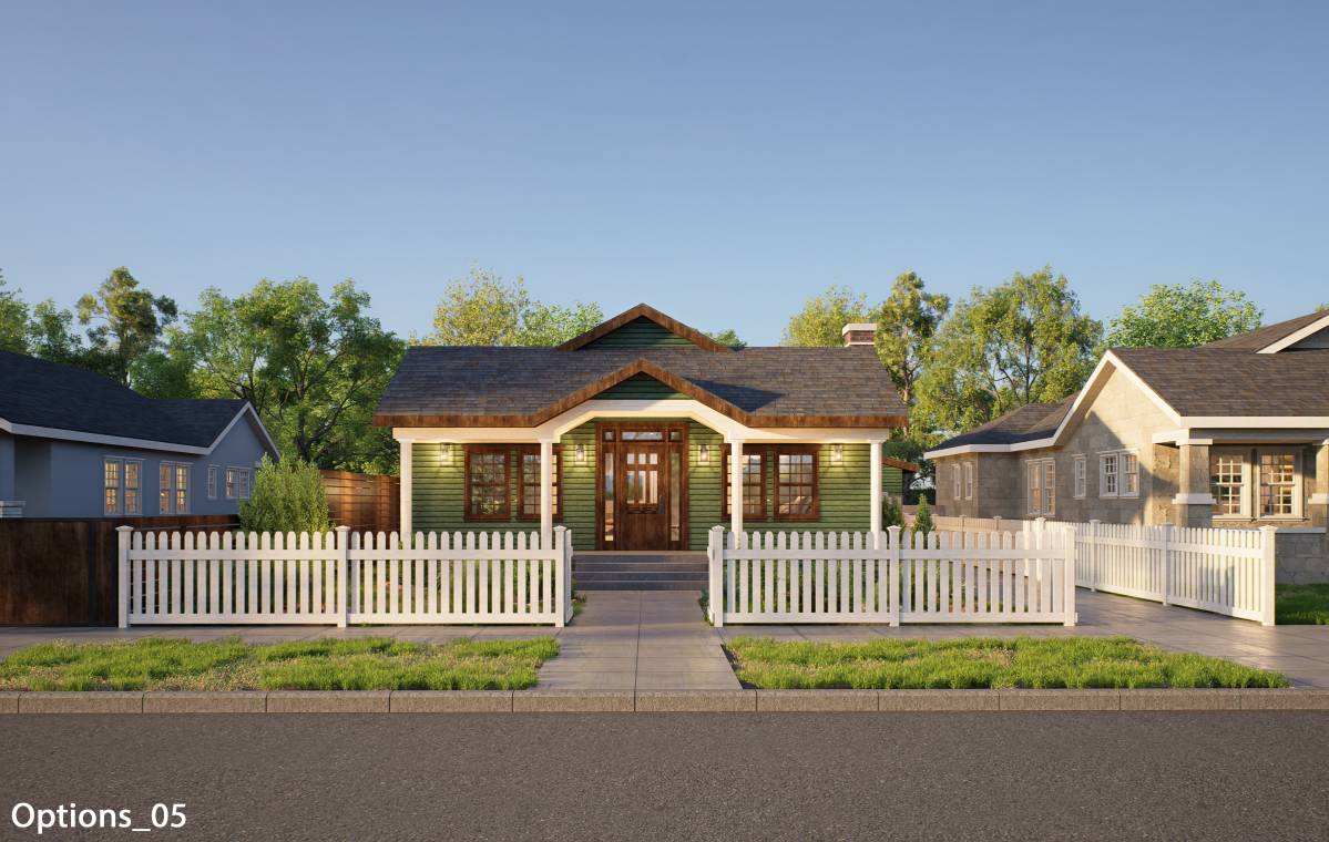
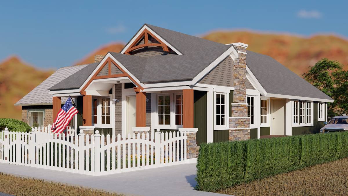
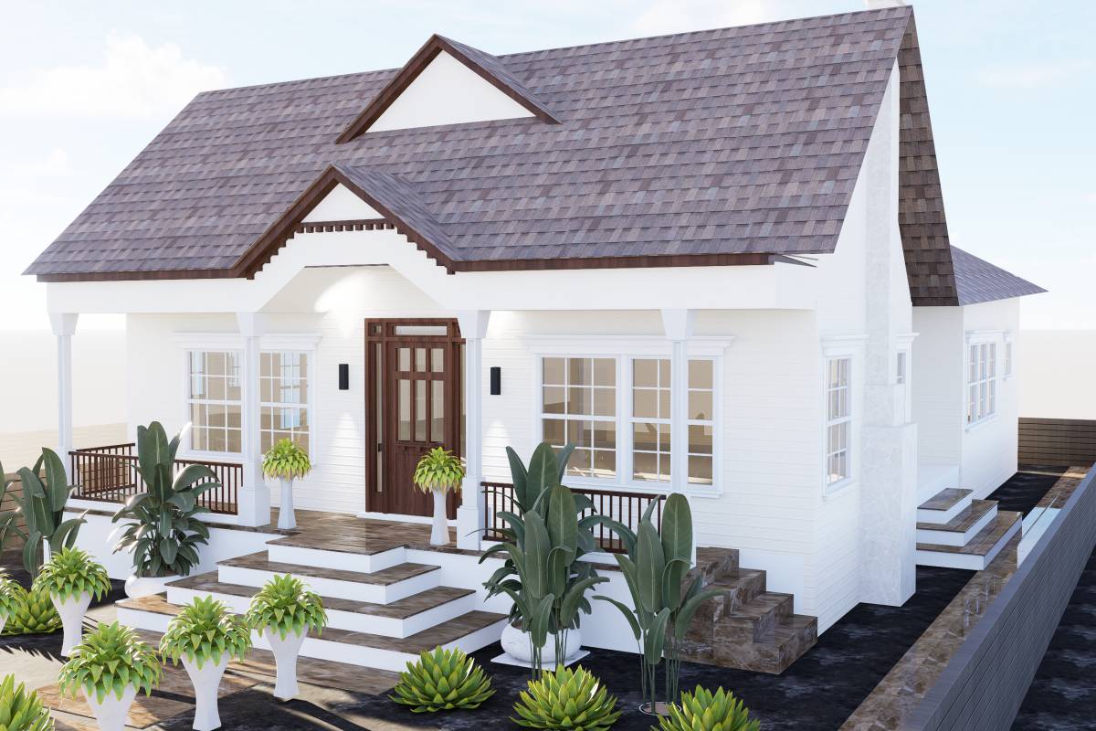
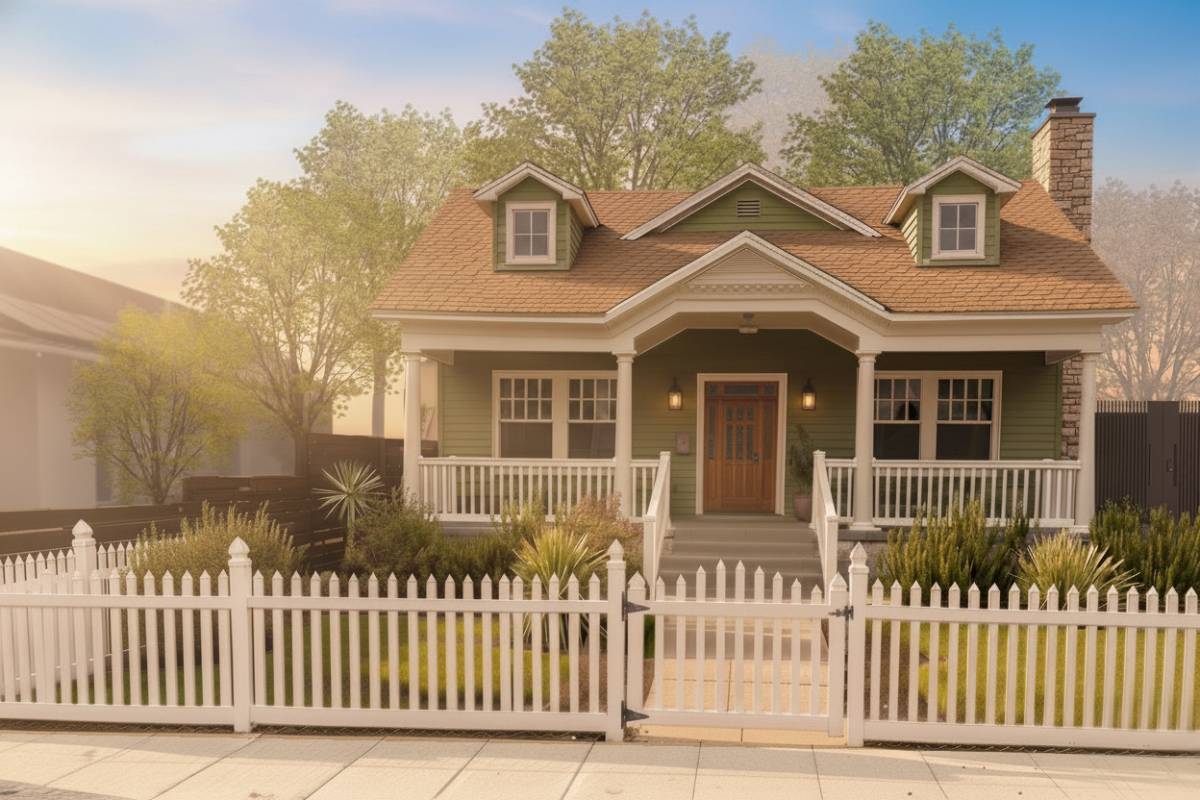
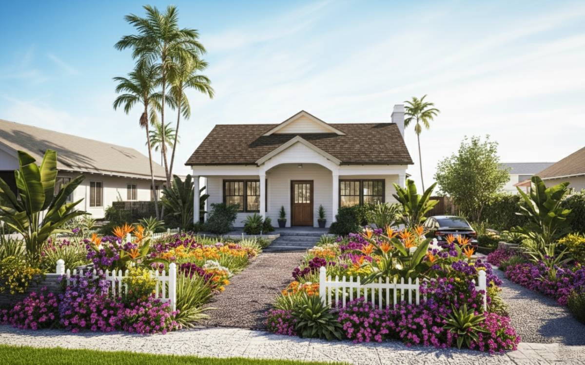
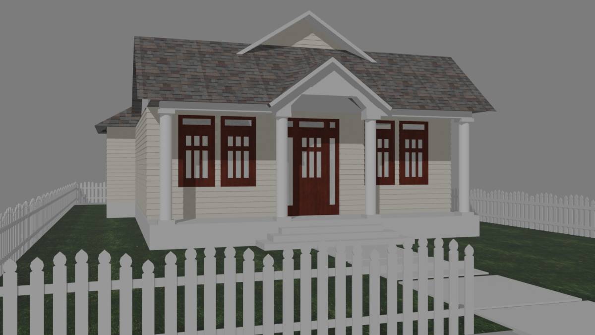
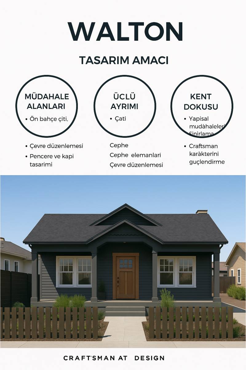
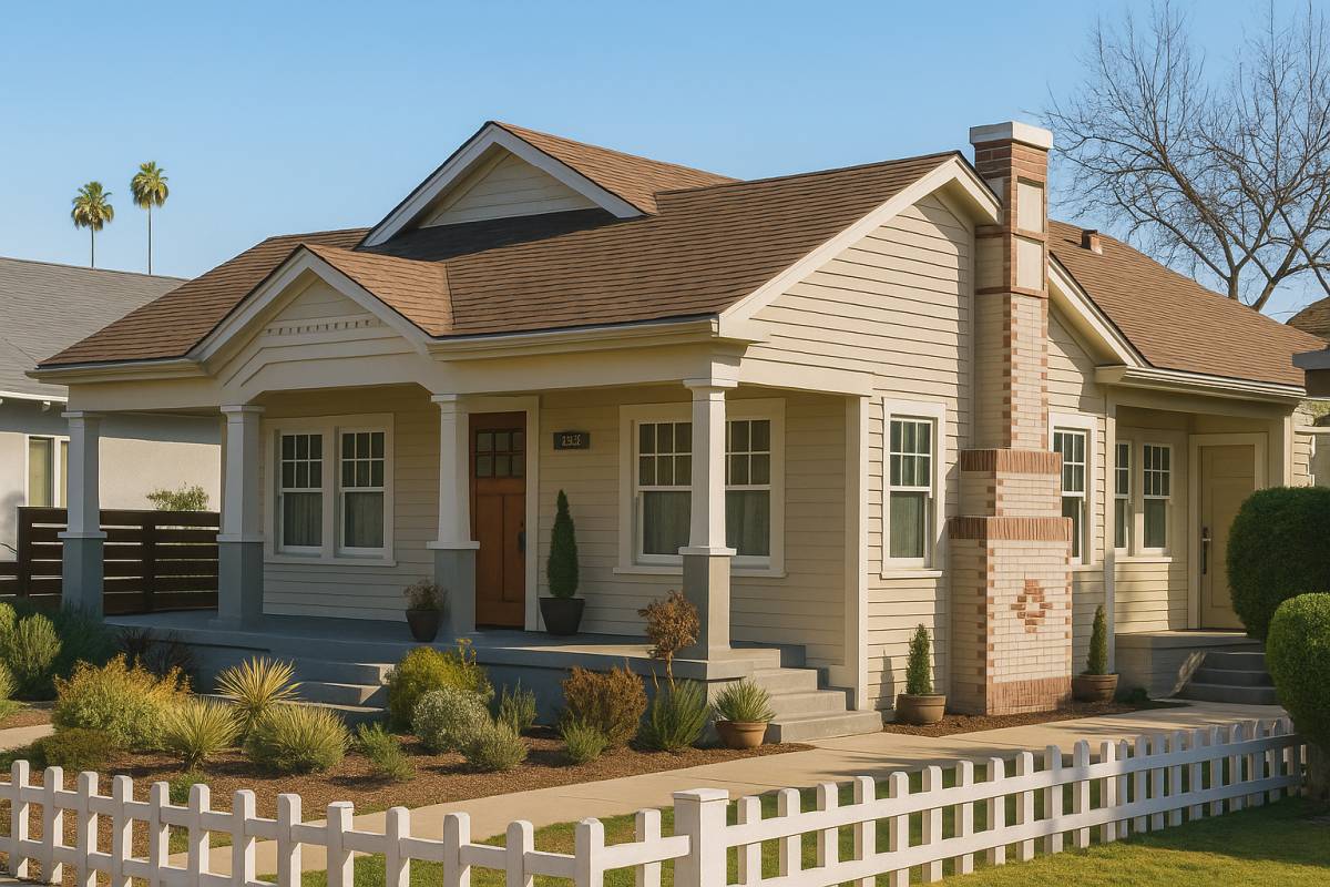
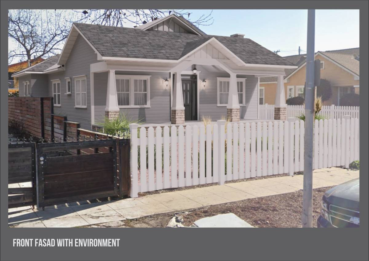
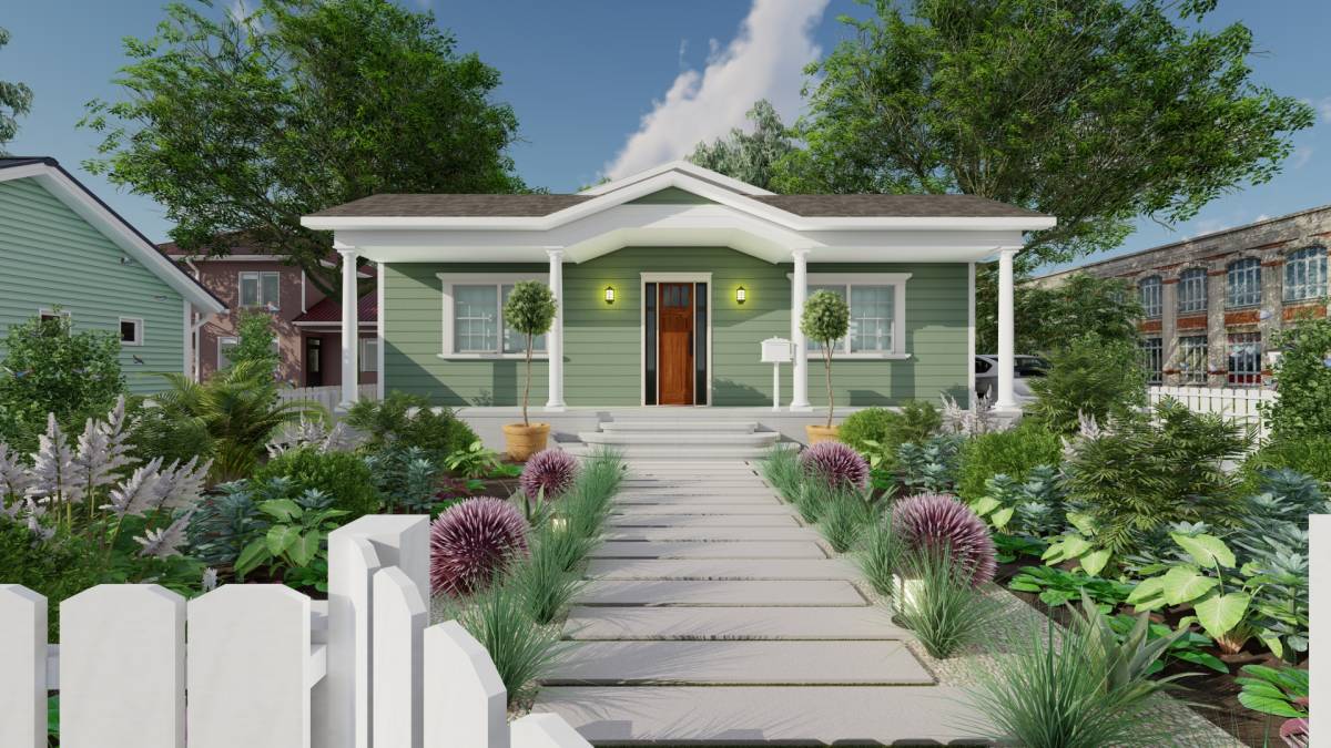
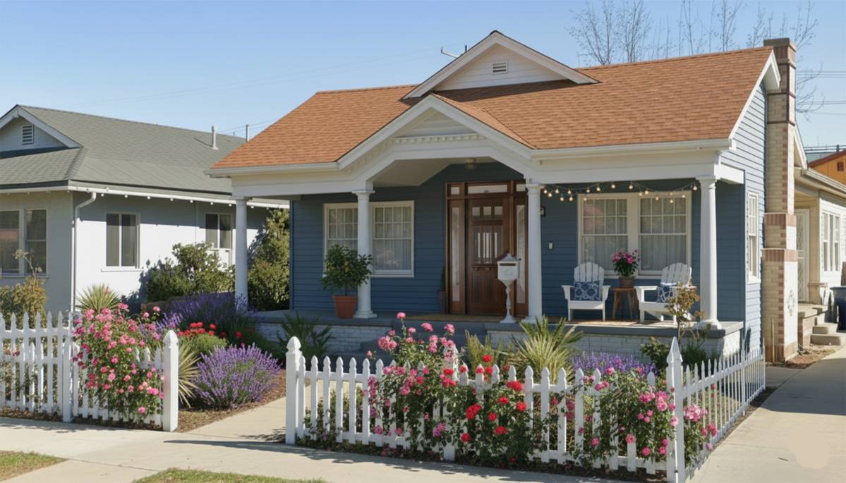
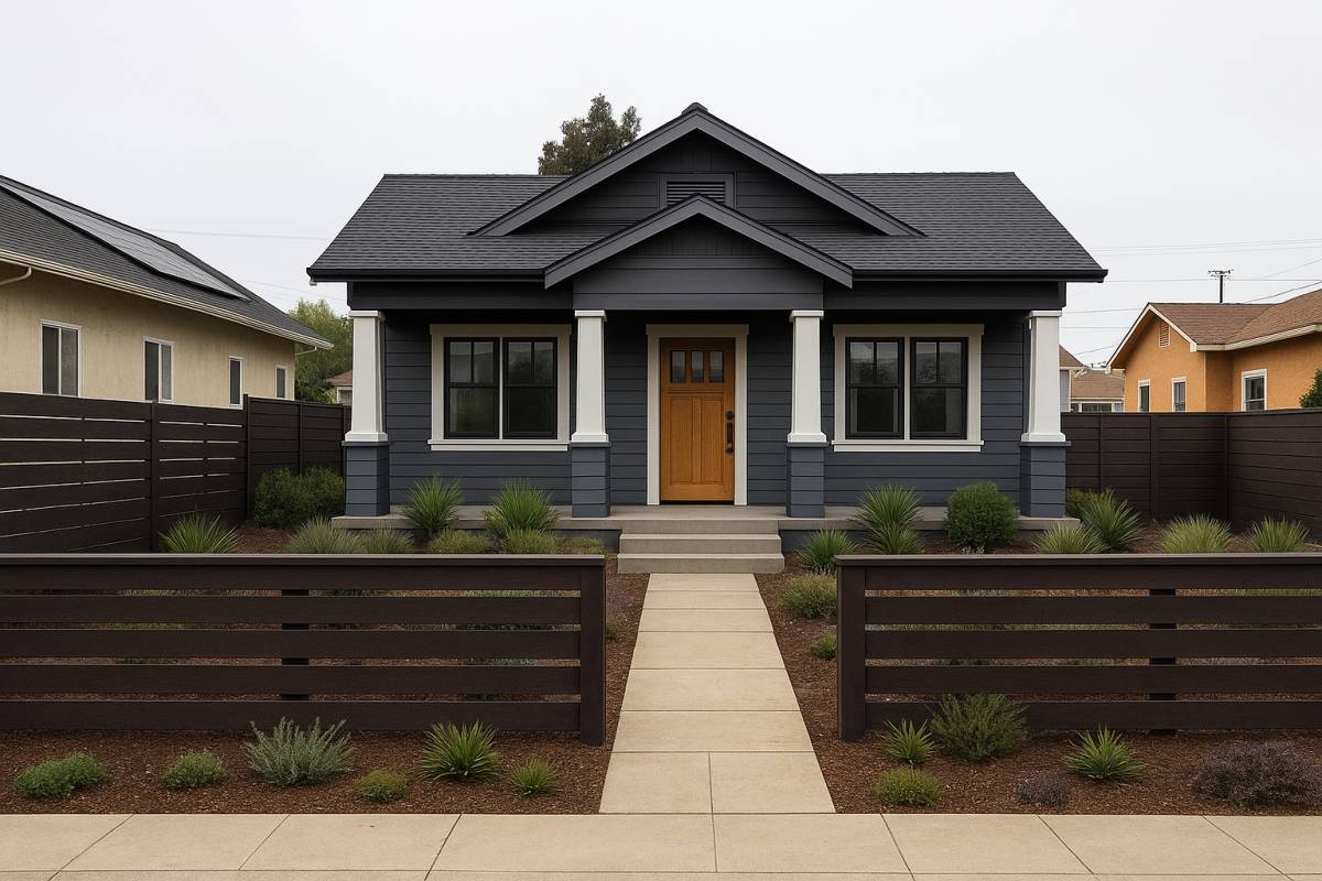
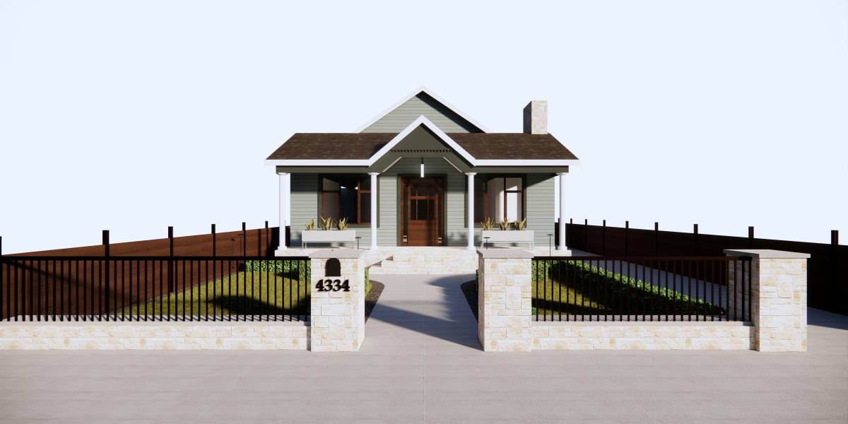
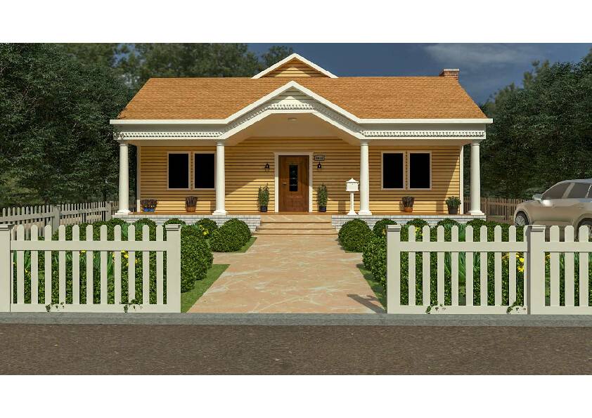
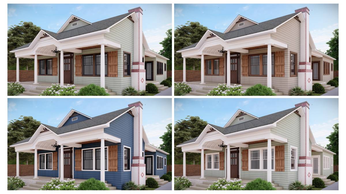
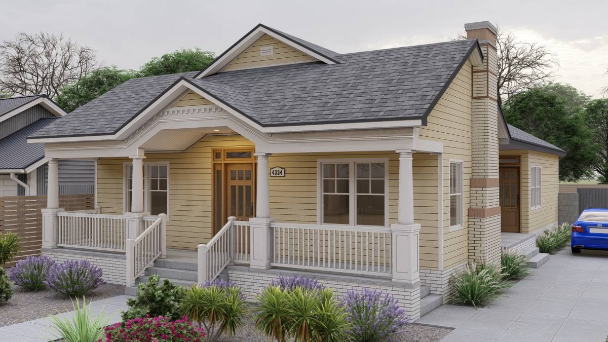
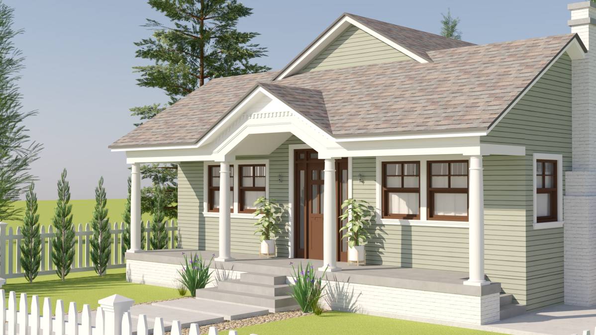
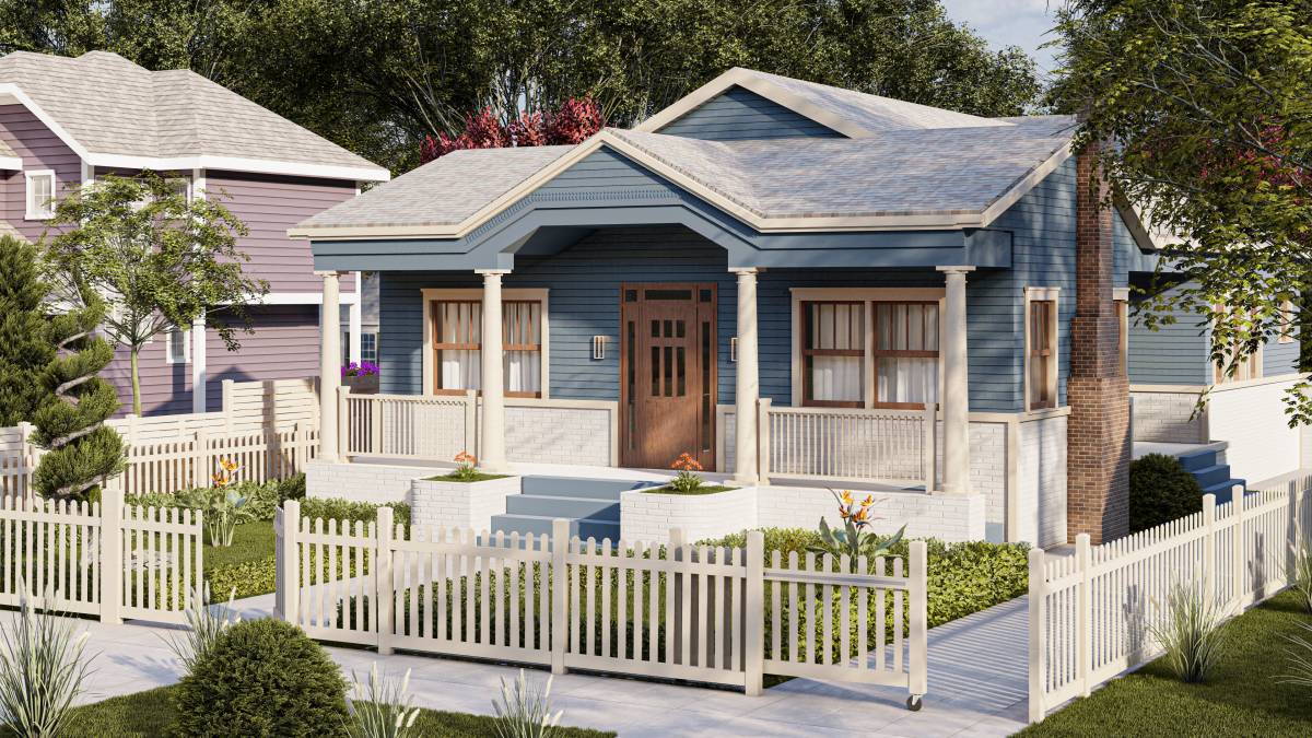
I prepared a total of three different color variations inspired by the Craftsman style. I chose pastel blue as the dominant color, complemented by white as the contrasting tone. Additionally, I haven’t yet tested the white, beige, and brown combinations on the columns, eaves, gutters, and garden fences. However, I incorporated beige tones into some of the presentation visuals — as you may notice, its effect is slightly softer compared to pure white.
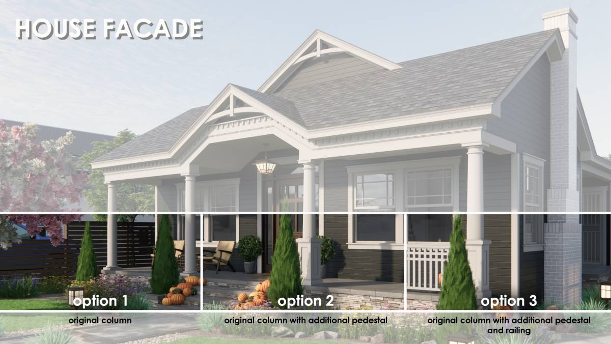
For the windows and doors, I maintained a similar aesthetic as per your request. On the facade, I used American siding as the main cladding material, while replacing the areas under the windows and the plinth walls with light gray stone veneer.
Wishing you a great day — I hope you like the results.
Best regards,

 佳作